TLDR
Successful alternate art mtg proxy deck design starts with one visual rule, not 100 separate image searches. Write a short art-direction brief, establish a few elements that remain constant, and assign controlled variations to commanders, lands, spells, permanents, and tokens. Test seven representative cards before finishing the deck. Then proof the project both one card at a time and as a battlefield, where category recognition matters as much as close-up beauty.
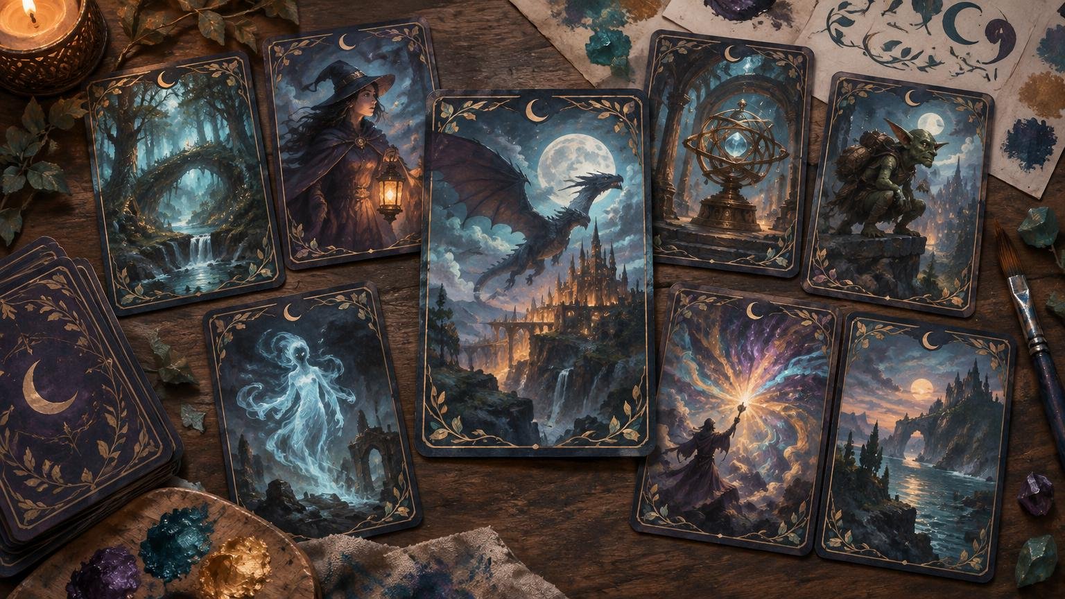
A folder full of excellent illustrations does not automatically become a coherent deck. Once dozens of unrelated crops, palettes, frames, and lighting styles share a table, each card competes for attention. The answer is to treat alternate art mtg proxy deck design as a visual system. Repetition creates identity; purposeful variation keeps that identity from becoming monotonous.
Write a one-sentence art-direction brief
Begin by defining the world in which every card belongs. The brief should identify the visual setting, emotional tone, dominant medium or texture, palette, recurring motif, and at least one exclusion. If it cannot help you reject an attractive but unsuitable image, it is still a mood rather than a usable direction.
Use this template: “This deck depicts [visual world] with a [mood] atmosphere, using [medium or texture], a palette led by [color roles], and recurring [motif], while avoiding [specific conflicting qualities].”
For example: “This deck depicts a flooded astronomical archive with a quiet, mysterious atmosphere, using ink-wash textures, deep blue-black shadows, oxidized copper accents, and recurring circular charts, while avoiding bright comic outlines and modern technology.” That sentence answers practical questions about a fiery removal spell, a mechanical artifact, or a sunny basic land without forcing every illustration to look identical.
A theme inspired by a genre or mood should also look like its own clearly unofficial creative project rather than presenting itself as an official collaboration. A worked themed-deck example shows how recurring color, symbols, layouts, and proofing can hold a recognizable visual idea together across many cards. See the cohesive magical-girl deck example.
Set the rules that will hold all 100 cards together
Choose a small number of non-negotiable rules before gathering final art. These rules should govern the information layer as well as the illustration. A consistent frame cannot rescue a deck if names disappear, rules boxes merge into the art, or similar permanents become impossible to distinguish across the table.
- Frame and border logic: Decide whether the deck uses one frame family, a small set of category-specific frames, or borderless art with a repeated information panel.
- Information hierarchy: Keep the card name, mana cost, type line, rules text, and power or loyalty information in predictable locations with dependable separation from the art.
- Crop rule: Define whether portraits favor head-and-shoulders compositions, environmental scenes use wide focal areas, and important objects receive clear negative space.
- Value and lighting range: Decide how dark the project may become and where lighter zones must appear behind important information.
- Ornament limit: Choose one or two recurring decorative devices rather than introducing new corners, flourishes, icons, and textures on every card.
- Variation rule: Specify which elements may change by card group, color identity, or narrative importance.
Palette is especially useful when it has jobs. Instead of choosing five colors merely because they look attractive together, assign roles such as dominant field color, neutral text support, warm accent, cool accent, and rare highlight. Then define how those roles shift for different card groups. The deeper deck-wide color palette guide explains how to turn a mood board into working palette roles and rejection criteria.
Assign each card group a visual role
Cohesion does not mean applying one treatment indiscriminately. A functional deck needs visible categories. Give each group a recognizable role while preserving the shared palette, texture, and framing logic.
| Card group | Recommended visual role | Useful variation |
|---|---|---|
| Commander and signature cards | Primary focal point | Stronger highlight color, expanded motif, or one special frame treatment |
| Creatures | Characters and inhabitants of the visual world | Variation by faction, creature type, or battlefield role |
| Instants and sorceries | Actions, weather, energy, and moments of change | More directional movement while retaining the shared palette |
| Artifacts and enchantments | Objects, structures, symbols, and persistent forces | Distinct framing or material texture for rapid recognition |
| Basic and nonbasic lands | The environment that contains the deck | A coordinated cycle with recognizable land cues and restrained detail |
| Tokens and helper cards | Supporting game pieces | Simpler compositions and category labels that remain distinct at a glance |
| Double-faced and unusual cards | Exceptions requiring operational clarity | Repeated face markers, orientation cues, and an explicit back-handling plan |
The commander should be special, but not so visually loud that every other card feels unfinished. Give it one privilege: perhaps a brighter accent, enlarged recurring symbol, unique border, or more theatrical lighting. Combining all four can make the card look as though it belongs to another project.
Basic lands benefit from a family resemblance plus immediate differentiation. Repeat the horizon, architectural language, texture, or framing device, but reserve an unmistakable environmental cue for each land type. If lands are a major part of the concept, use a dedicated matching basic-land cycle process rather than treating them as late-stage filler.
Use different artists without creating visual noise
A deck can use work from different artists if the selection rule is stronger than the differences between them. Match images by composition, value structure, texture, edge treatment, and emotional temperature rather than relying only on subject matter. A watercolor dragon, glossy 3D forest, graphic-novel knight, and photorealistic artifact may all fit the same fantasy label while looking unrelated in practice.
Normalize cautiously. A shared frame, restrained color treatment, or repeated background texture can bridge moderate differences. Heavy filters applied to every image often flatten intentional color choices and create muddy shadows. Rejecting a mismatched asset is usually better than forcing it into compliance through aggressive editing.
Allow controlled exceptions, not accumulating exceptions
An exception should communicate importance or function. The commander, a small cycle of signature cards, or a transformed face may earn a distinct treatment. Write down exactly why the exception exists and which cards receive it. If the reason becomes “this image looked cool,” the system will quickly unravel.
Limit the deck to one or two meaningful exception families. For example, the commander and three signature cards might use copper highlights, while double-faced cards use a separate orientation device. Foil-like effects, alternate borders, monochrome cards, ornate nameplates, and edge-to-edge layouts should not all become independent reward systems.
Test seven cards before designing the full deck
Do not complete 100 files before discovering that the rules box is too translucent or the palette turns muddy at card size. Build a representative test set that stresses the visual system. The site’s project workflow likewise recommends testing representative cards and planning special cases before final production.
- The commander, to test the highest visual emphasis.
- One basic land, to test repetition and battlefield recognition.
- One artifact, to see whether colorless cards still belong in the project.
- One enchantment, to test persistent-permanent differentiation.
- One text-heavy card, to expose information-layer problems.
- One card with very dark or detailed art, to test the most difficult values and crop.
- One token, double-faced card, or unusual layout, to test special handling.
Place the seven cards together as a miniature battlefield. If one card appears to come from another deck, determine whether the problem is palette, crop, framing, texture, or emphasis. Fix the rule rather than editing only that card. This small test set should become the project’s reference standard for later approvals.
Proof at card scale and battlefield scale
A full-screen image rewards details that may disappear when reduced. Review every file near its intended physical size, then arrange groups of cards at roughly tabletop viewing distance. The two views answer different questions: close inspection reveals text and crop failures, while the wider view reveals weak category recognition and competing focal points.
- Confirm that names, costs, type lines, and game information remain readable over every background.
- Check that important faces, hands, symbols, and objects have not been trapped against crop edges.
- Look for dark art merging into dark frames or bright art swallowing pale information panels.
- Compare creatures, lands, artifacts, enchantments, and tokens as groups rather than isolated files.
- Check that tokens and helper cards cannot be mistaken for cards that belong in the library.
- Verify both faces and orientation cues for double-faced cards.
- Review the back independently; it should be simpler than the front and clearly identify the project as unofficial.
The W3C’s WCAG contrast guidance is a useful general explanation of why foreground and background separation matters, including for text rendered in images. It is designed for web accessibility, however, not as a production specification for physical Magic-style cards. Use it to sharpen your contrast thinking, then judge the actual card-size proof under realistic lighting.
Keep one source of truth for the project
Large decks develop administrative problems as quickly as visual ones. Create a master sheet before files begin multiplying. Give every card a stable ID that remains unchanged even if its deck position, art, or filename changes. The master record should track card name, current deck status, asset source, permission or commission notes, crop version, layout version, approval status, assigned back, and special handling.
Use filenames that distinguish drafts from approved exports. “CardName-final” stops being useful once final2 and final-revised appear. A more durable pattern combines the stable ID, short card name, layout version, art version, and status. Freeze the decklist at a named milestone, record later swaps separately, and keep editable source files apart from approved print exports.
This discipline also makes replacements easier months later. You can reproduce the same back, frame, color treatment, and export logic without reverse-engineering an old image. The complete custom proxy project checklist covers the progression from the initial theme through asset tracking, special cards, proofing, and final handoff.
Before sharing or producing the deck
Confirm that you own, commissioned, or have permission to use the relevant artwork and personal assets under terms appropriate to the project. Keep source and permission notes with the master record rather than relying on memory. Rights questions depend on the particular asset and agreement, so workflow documentation should not be mistaken for a legal conclusion.
Add a clear unofficial identifier and avoid imitating authenticity or provenance features. Ask the intended playgroup, venue, or organizer what it accepts before bringing the deck. If the project is ready for physical production, export only the approved files and retain an archive of the exact handoff set. Projects that extend into other card games can use cross-TCG proxy production as a relevant next-step destination, but production should begin only after the visual and file audits are complete.
What about sanctioned events?
Wizards’ published January 2016 policy announcement said DCI-sanctioned events required authentic Magic cards and described a narrow judge-issued exception for cards damaged during an event. Treat that as a dated policy statement, not a complete substitute for current event documents. Review the current rules and ask the organizer before attending. Read Wizards’ January 2016 proxy-policy announcement.
Frequently asked questions
Should every card use the same art style and frame?
No. Every card should follow the same visual logic, but controlled differences improve navigation. Keep the palette roles, information hierarchy, ornament vocabulary, and crop philosophy stable. Let card groups vary through defined frame accents, compositions, or textures.
How many colors should the palette contain?
There is no universal correct number. A useful palette has enough roles to handle backgrounds, information panels, accents, and highlights without making every card equally colorful. Start with a restrained core and add a color only when it has a defined job.
How should tokens and emblems match the deck?
Reuse the deck’s palette, symbols, and texture, but simplify the composition and make the object type obvious. Tokens need to remain distinguishable from library cards and from one another. Emblems can share a dedicated visual family; the matching custom-emblem guide covers that system in more depth.
Can a custom back work with double-faced cards?
Yes, but the handling plan must be explicit before production. Decide how each face will be represented, how players will identify the active face, and whether sleeves or helper cards are needed for the intended setting. Keep the custom back simple, consistent, and clearly unofficial.
Build a system, not a pile of highlights
A cohesive alternate-art deck does not make every card identical. It repeats relationships: the same palette roles, information hierarchy, crop logic, motifs, and rules for emphasis. Variation then tells the player what a card is and how important it should feel.
Before finishing the other files, write the one-sentence brief, define the non-negotiable rules, and build the seven-card test set. If those cards remain readable individually and recognizable together, the deck has a visual direction sturdy enough to carry the full project.
References
- Sailor Moon-Themed MTG Proxies: Building a Cohesive Magical-Girl Deck – Custom MTG Proxies
- How to Build a Color Palette for a Full Alternate-Art Proxy Deck – Custom MTG Proxies
- Custom MTG Proxy Project Checklist: From Theme Idea to Finished Print Files – Custom MTG Proxies
- Understanding Success Criterion 1.4.3: Contrast (Minimum) | WAI | W3C
- On Proxies, Policy, and Communication | MAGIC: THE GATHERING