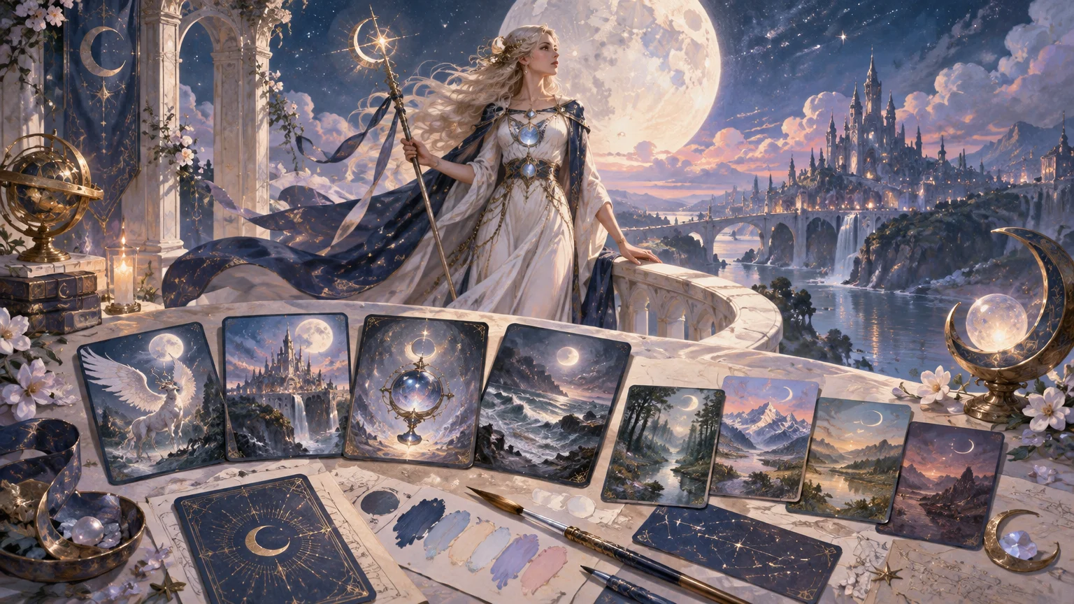
TLDR: Build the deck around a limited visual language rather than 100 unrelated character portraits. Use midnight blue as the structural color, pearl and white for clarity, pink or violet for category cues, and gold only for focal accents. Give crescent moons, planetary glyphs, crystals, ribbons, and eclipses specific jobs. Keep Magic’s information hierarchy stable, reserve two-sided transformation sequences for actual double-faced cards, and proof the project both card by card and as a crowded battlefield.
The strongest Sailor Moon themed MTG proxies feel like one magical-girl world without pretending to be an official collaboration. The practical route is to create original, commissioned, or properly licensed artwork inspired by lunar fantasy, transformation sequences, celestial guardians, jeweled objects, friendship, and dramatic cosmic villains. That gives the project a recognizable mood without relying on copied screenshots, logos, or unapproved fan art.
Start Sailor Moon themed MTG proxies with one design brief
Before assigning artwork, write one sentence that could guide every card. A useful brief identifies the mood, palette, recurring motifs, illustration approach, and one or two exclusions.
For example: “A luminous lunar-guardian deck illustrated as original painted animation cels, using midnight blue, pearl white, soft pink, violet, and restrained gold; crescents mark signature cards, planetary symbols organize the mana base, and no card uses photographic screenshots or imitation official branding.”
The exclusions matter. Without them, a project can drift from painterly portraits to screenshots, chibi art, ornate manga panels, and realistic space scenes. Each image may be attractive, but the deck stops looking intentional. A brief gives you a reason to reject art that is individually appealing but wrong for the system.
Give every palette color a job
A deck-wide palette works best when colors have roles rather than equal billing. Planning those roles across commanders, lands, artifacts, tokens, and backs also makes later revisions easier. This full-deck color palette method recommends testing the system at intended card scale and within a simulated crowded board state.
- Midnight blue: Use as the structural dark for outer space, frame edges, title areas, shadows, and visual continuity.
- Pearl white: Reserve for readable text support, moonlight, costume highlights, and separation between figures and dark backgrounds.
- Soft pink: Apply to hopeful effects, healing imagery, relationships, or a selected card group rather than washing it across everything.
- Violet: Use for mystery, psychic effects, night skies, and controlled transitions between blue shadows and pink highlights.
- Restrained gold: Save for crowns, transformation objects, legendary accents, or thin borders. If every card glows gold, no card feels important.
- Threat colors: Develop a related but distinct scheme for antagonistic effects—perhaps eclipsed violet, black-red shadow, or sickly reflected light—without abandoning the deck’s overall rendering style.
The commander should receive the fullest version of the palette. Supporting cards can each omit one or two accents. That creates hierarchy: the commander looks like the visual thesis, while the rest of the deck looks like evidence supporting it.
Assign recurring symbols instead of decorating randomly
Recurring symbols help players recognize card roles before reading every line. The key is to assign each motif a job and resist using all of them on every card.
| Motif | Best visual role | Useful restraint |
|---|---|---|
| Crescent moon | Commander, signature legends, decisive spells | Keep it rare enough to signal importance |
| Planetary glyph | Land families, color groups, supporting legends | Pair it with color and scenery so recognition does not depend on a tiny symbol |
| Crystal or jewel | Mana rocks, treasures, equipment, resource effects | Vary silhouette or setting, not the underlying rendering style |
| Ribbon or light trail | Enchantments, auras, protective effects | Keep trails away from names, mana symbols, and rules text |
| Starburst | Instants, sorceries, climactic effects | Use as directional composition rather than background noise |
| Eclipse | Removal, sacrifice, corruption, or villainous effects | Maintain enough edge contrast that dark art does not collapse at card size |
A symbol system should reinforce gameplay, not become a second rules language the player has to memorize. Names, mana costs, type lines, rules text, and power/toughness remain the primary information. Motifs are supporting cues.
Map the visual system across the whole deck
Divide the deck into visual families before selecting final illustrations. This prevents the common failure mode in which the first 20 cards receive careful direction and the remaining files are filled with whatever art is available.
- Commander: A centered or upward-moving composition, complete palette, clearest lunar emblem, and strongest silhouette.
- Supporting legends: Character-led compositions with individual planetary or elemental cues, but simpler ornament than the commander.
- Creatures: Repeated staging rules, such as full figures for major threats and dynamic three-quarter poses for smaller creatures.
- Artifacts: Transformation objects, mirrored devices, crystals, ceremonial tools, or celestial machinery shown against quieter backgrounds.
- Enchantments: Flowing light, ribbons, halos, constellations, and environmental magic rather than another series of portraits.
- Instants and sorceries: The deck’s most kinetic scenes. Use direction, impact, and spell effects while protecting the text area.
- Tokens and emblems: Simplified silhouettes, larger symbols, and reduced ornament so they remain distinct from normal deck cards.
This division creates variation without sacrificing unity. It also keeps a character-heavy theme from turning every card into the same centered portrait with a different face.
Build the mana base as a sequence of places
A matching land cycle should share an illustration style, frame treatment, lighting rule, and recurring motif while preserving distinct scene roles and color cues. The detailed matching basic-land cycle guide expands that method for Commander projects.
For a lunar magical-girl deck, treat the mana base as a journey through connected celestial locations. One land family might show a moonlit palace garden, another a mirrored ocean beneath a planet, and another an eclipsed city. Keep the same horizon height, celestial lighting direction, and border treatment throughout the cycle.
Recognition still comes first. Do not rely exclusively on a tiny planetary glyph or subtle tint. A player should be able to separate land groups through dominant color, environment, and composition from across the table. You can repeat a few illustrations across basic lands if each land type remains unmistakable; cohesion does not require dozens of unique scenes.
Use transformation imagery deliberately
A transformation scene is an aesthetic idea; transforming is also a specific game action. Most single-faced cards can depict a power-up through a split composition, reflected costume, before-and-after pose, or spiral of light without becoming mechanically double-faced.
Reserve a true two-sided sequence for an underlying double-faced card or appropriate double-faced token. The comprehensive rules state that only permanents represented by double-faced cards or double-faced tokens can transform or convert. If the card must enter a hidden zone, it also needs to remain indistinguishable from the other cards there; the rules framework addresses opaque sleeves and substitute cards for that purpose. Consult the Magic Comprehensive Rules before finalizing a two-sided treatment.
Keep both faces visibly related. Repeat the character silhouette, camera angle, border geometry, or emblem position so the change reads as a transformation rather than two unrelated illustrations. Make the transformed side brighter, more symmetrical, or more ornamented, but preserve the usual locations of game information.
Proof readability twice: card scale and battlefield scale
Large artwork previews hide many failures. Fine jewelry can disappear after reduction, dark blue hair can merge into a night sky, and pale ribbons can cross directly behind white rules text. Review every card at its intended physical size rather than judging only from a zoomed canvas.
- Check the name and mana cost without zooming. These should remain the fastest elements to find.
- Confirm the type line and rules box have stable backing. Detailed art should not compete with small text.
- Inspect the focal point. Faces, hands, transformation objects, and spell effects should survive reduction.
- Compare several cards side by side. Look for accidental shifts in border width, title placement, saturation, and symbol scale.
- Create a crowded battlefield mock-up with lands, creatures, artifacts, enchantments, and tokens. Each family should remain distinguishable.
- Print or export a final contact sheet and mark every correction before replacing individual files.
If a design only works when viewed alone at high resolution, simplify it. Darken or blur the area behind text, enlarge the focal object, remove minor sparkles, or crop closer. The goal is not to preserve every detail from the original canvas; it is to preserve the scene’s meaning at card size.
Make tokens, helpers, and backs part of the project
Tokens are gameplay markers rather than cards under the Magic rules, even when card-sized objects represent them. Use that distinction visually. Tokens can have oversized type labels, simplified frames, larger power/toughness, or a repeated corner marker. Emblems, Monarch cards, Initiative reminders, and other shared helpers can use another consistent treatment so players do not shuffle them into the library by mistake.
The custom back should summarize the deck rather than imitate an authentic Magic back. A lunar crest, project title, broad color identity, and clearly unofficial treatment are enough. For double-faced cards, keep the sleeve and substitute-card plan in mind before committing to a back system.
Track artwork, permission, and versions
Finding an image online does not establish permission to reproduce it. Keep original, commissioned, or appropriately licensed assets separate from reference material, and record the permission or license associated with each final image. Do not describe the project as officially affiliated with Sailor Moon unless you actually hold documented authorization to do so.
A simple tracker prevents a 100-card project from becoming a folder of nearly identical finals.
- Card name and deck category
- Artist or asset source
- Permission or license record
- Artwork file name and crop version
- Frame or layout version
- Single-faced or double-faced status
- Readability review status
- Board-state review status
- Approval date and revision notes
- Final export name and replacement history
Use predictable names such as CardName_art-v03_frame-v02_APPROVED rather than final-final-new. Keep editable files separate from print-ready exports, and archive the approved version before making experimental changes. When every file passes the contact-sheet review, the project can move to the physical handoff stage through a destination for custom MTG proxy printing.
Set play expectations before the first game
Share the project with the playgroup or organizer before using it. The relevant question is not only whether proxies are generally welcome, but whether the alternate frames, renamed visual cues, custom backs, and transformation treatments remain easy for everyone to follow.
Do not assume casual acceptance carries into organized play. Wizards’ published proxy policy states that DCI-sanctioned events require authentic Magic cards apart from limited judge-issued replacement circumstances during an event. Because that statement dates from 2016 and event requirements can change, check the current organizer guidance. The official Wizards proxy policy statement provides the underlying context.
Frequently asked questions
Can I use official Sailor Moon screenshots or logos?
Do not assume that online availability grants reproduction rights. A safer project workflow uses your own artwork, documented commissions, or assets with permission covering the intended use. Original lunar magical-girl imagery also makes it easier to avoid implying an official collaboration.
How should the commander differ from the rest of the deck?
Give it the complete palette, clearest crescent motif, strongest silhouette, and most formal composition. Supporting legends can share the style while using fewer accents or smaller symbols. The difference should be visible without making the remaining cards feel unfinished.
Does every transformation scene need a double-faced card?
No. A single-faced card can illustrate transformation as a moment within one composition. Use a true front-and-back sequence only when the underlying Magic object is actually double-faced and the treatment follows the relevant gameplay requirements.
Should every basic land have unique artwork?
Not necessarily. A smaller set of repeated scenes can look more coherent and reduce production work. Prioritize immediate land identification, consistent lighting, and a clear relationship among locations over uniqueness for its own sake.
What should I test before preparing the entire deck?
Start with the commander, one basic land from each relevant type, one artifact, one enchantment, one dense rules card, one dark illustration, and one token. You can also test the underlying Commander deck with proxies before investing time in a complete alternate-art treatment. A beautiful card that is later cut from the deck is still a cut card.
Make the theme repeatable
A cohesive magical-girl deck does not need a different flourish on every card. It needs a repeatable rule: one structural dark, a controlled light palette, a few symbols with assigned jobs, a distinct hierarchy for commanders and helpers, and a proofing process that catches failures at card and battlefield scale. Finalize a small representative batch first. If those cards look connected and remain readable in play, extend the same system across the deck.