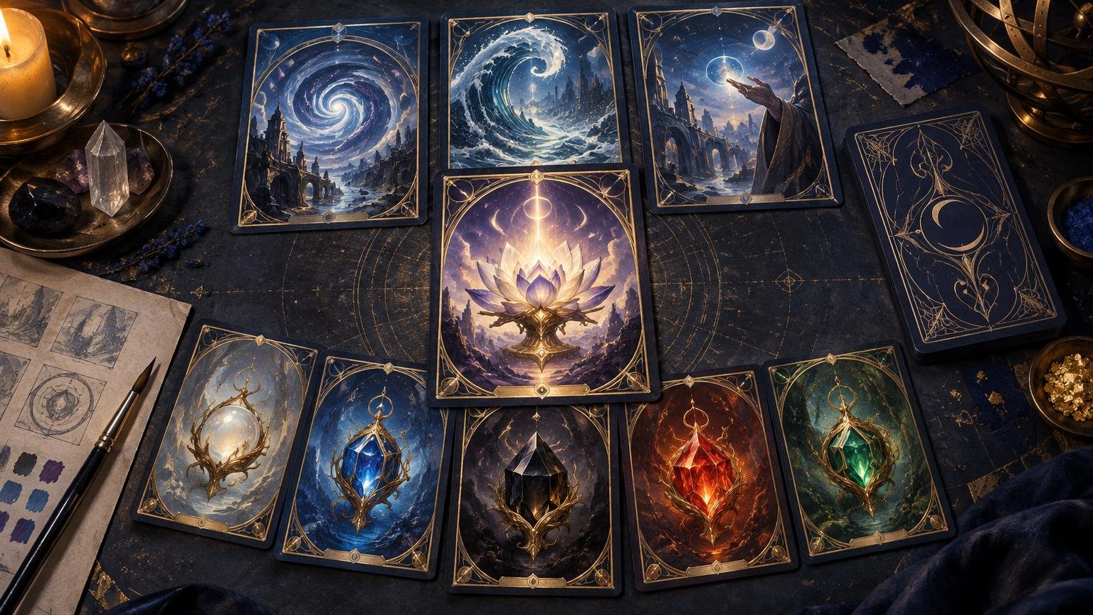
A custom Power Nine proxy set should look like nine parts of one artifact, not nine unrelated illustrations gathered under a famous name. The challenge is to give Black Lotus, the five Moxen, and the three blue spells a shared visual identity while preserving enough variation that players can identify each card quickly.
That makes this a compact but demanding art-direction project. You need a rule for the entire set, a visual language for its subgroups, and a controlled exception for Black Lotus. You also need card-size proofs, because ornate frames and cinematic artwork that look magnificent on a monitor can collapse into decorative fog in a sleeve.
TLDR
Build the set around one repeated frame, palette, typography system, set symbol, and back. Give the five Moxen a common composition, treat the three blue spells as a related sequence, and reserve one deliberate exception for Black Lotus. Proof at physical size before finalizing all nine cards, and keep the proxies unmistakably unofficial.
Start with the actual nine-card structure
The Power Nine consists of Black Lotus, Ancestral Recall, Time Walk, Timetwister, Mox Sapphire, Mox Jet, Mox Ruby, Mox Pearl, and Mox Emerald, as identified in Wizards of the Coast’s Power Nine overview. That list already contains a useful design hierarchy: Black Lotus and the five Moxen form an artifact-and-mana group, while Ancestral Recall, Time Walk, and Timetwister are blue spells.
Do not flatten that hierarchy by giving every card an identical composition. Matching does not mean cloning. A stronger system gives the nine cards a shared frame and surface language while letting their imagery express three roles: centerpiece, cycle, and sequence.
| Group | Cards | Recommended visual relationship |
|---|---|---|
| Centerpiece | Black Lotus | The set’s strongest focal image and one controlled frame exception |
| Artifact cycle | Five Moxen | Repeated composition with distinct color, material, light, or environment |
| Blue sequence | Ancestral Recall, Time Walk, Timetwister | Related narrative or motion language with clearly different silhouettes |
This structure keeps the set legible in a Cube draft or across a table. A viewer should first recognize that all nine belong together, then identify the subgroup, then identify the individual card. If the viewer has to read every title before distinguishing a Mox from Time Walk, the art direction is doing too little functional work.
Write one visual rule before choosing artwork
A useful visual rule is a single sentence that could reject an otherwise attractive image. For example: “Every card depicts a relic inside the same ruined observatory, with one dominant gem color and a circular light source behind the subject.” Another could be: “The nine cards resemble illuminated manuscript plates, using flat gold ornament, dark mineral pigments, and one repeated botanical border.”
The rule should define subject treatment, setting, palette, lighting, and framing. It should not merely name a broad genre such as fantasy, cyberpunk, or Art Nouveau. Those labels still allow wildly different camera angles, rendering styles, contrast levels, and visual density.
For a more systematic way to choose those constraints, use the full-deck visual direction guide. Its project-level method works just as well for nine cards: decide what must repeat, what may vary, and which card earns an exception.
Design the Moxen as a cycle, not five isolated jewels
The five Moxen are the easiest place to establish repetition. Give them the same scale, camera angle, background architecture, and placement within the frame. Change only a controlled set of variables: the dominant color, gemstone geometry, surrounding material, elemental effect, or lighting temperature.
A reliable composition might place each Mox in the lower center, with a circular halo behind it and a vertical architectural element on either side. Sapphire can use cool blue refraction, Jet a dark reflective surface, Ruby an ember-lit interior, Pearl a pale iridescent glow, and Emerald green light filtered through foliage or mineral growth. The cards remain distinct without looking as though five different briefs were issued.
Avoid making color the only identifier. Foil glare, dim rooms, color-vision differences, and small thumbnails can weaken a color-only system. Give each Mox a second cue, such as a unique silhouette, border ornament, texture, or background motif.
Make the three blue spells a visual sequence
Ancestral Recall, Time Walk, and Timetwister need a different relationship. They are not a conventional five-part cycle, but their shared blue identity makes them a natural triptych. One approach is to depict three stages of the same event: memory recovered, time crossed, and reality rewritten. Another is to use one recurring figure shown in three distinct spatial conditions.
Keep their silhouettes unmistakable. Ancestral Recall might emphasize faces, echoes, or layered memories. Time Walk benefits from a strong path, doorway, or directional movement. Timetwister can use a spiral composition, but keep its central form broad enough to survive reduction. Three versions of “blue figure surrounded by magical particles” will match, but they will not identify themselves quickly.
Let Black Lotus break exactly one rule
Black Lotus should feel like the set’s visual center without looking imported from a different project. The cleanest method is to preserve the common frame, typography, border texture, and palette logic while breaking one compositional rule.
If every Mox uses a centered relic at medium scale, Black Lotus might fill more of the image area. If the other cards use closed circular halos, its halo might open beyond the frame. If the set is largely symmetrical, the Lotus could use a subtle asymmetry that creates tension. One exception feels intentional; five simultaneous exceptions look like a redesign.
Use the frame to unify, not smother, the artwork
The frame is the strongest repeatable element in a nine-card set, but it should not compete with the title, mana cost, type line, or rules text. Keep those elements in stable positions even if the outer ornament changes slightly between the artifact group and the blue-spell group.
Decorative frames often fail in three places: busy art continues behind text, thin ornament becomes visual noise, and low-contrast title bars disappear at card size. Use a restrained text-panel texture, a clear value shift behind the title, and larger structural shapes instead of dozens of tiny flourishes. The alternate-frame readability guide provides a useful test for deciding when visual invention has begun to slow recognition.
A small custom set symbol can carry the theme without consuming much space. Repeat the same symbol on all nine fronts and, if appropriate, on the shared back or storage divider. Keep it simple enough to remain recognizable when reduced; the custom set-symbol system guide explains how one mark can unite multiple project components.
Treat the card back as part of the set
Use one approved master back across all nine cards. If backs vary by card, a face-down card can reveal information before it is turned over. A shared back also gives the project a natural place for its title, set symbol, or restrained creator credit.
The back should make the cards clearly unofficial without becoming a poster squeezed into card dimensions. A simple emblem, project name, broad border, and strong central contrast usually work better than a miniature collage. Review the back at physical size and check it both upright and rotated, since sleeves and play can obscure orientation cues.
Choose finishes after the art direction is stable
Foil, holographic, gloss, and similar effects should support the visual rule rather than rescue weak files. Reflective treatments can make muddy shadows, fine details, and low-contrast text harder to read. Art built around large luminous shapes, clear silhouettes, and controlled dark areas is generally safer than artwork packed with tiny highlights across the entire image.
If the project will use a reflective finish, prepare a representative proof containing a dark Mox, a bright Mox, one text-dense blue spell, and Black Lotus. That selection exposes more potential failures than proofing only the cleanest card.
Build a proofing and version-control workflow
Nine cards are few enough to feel manageable and numerous enough for revision mistakes. Assign each card a stable ID such as P9-LOTUS, P9-MOX-SAPPHIRE, and P9-TIME-WALK. Add a revision suffix to working files, but keep the base ID unchanged. Record artwork source or commission information, crop status, front version, back version, and approval state.
- Create one rough card from each subgroup: Black Lotus, one Mox, and one blue spell.
- Reduce those three designs to physical card size and inspect title, mana cost, type line, rules text, and art focal point.
- Correct the shared master frame before duplicating it across the remaining cards.
- Complete all nine fronts, then compare them together in a three-by-three contact sheet.
- Freeze the approved list and archive the editable masters, final exports, fonts, linked assets, and shared back.
- Check every exported filename and front-to-back assignment before handoff.
A contact sheet is especially valuable here. It reveals when one Mox is much brighter than the other four, when a blue spell feels unrelated, or when Black Lotus has accumulated too many special treatments. For a broader handoff process, the custom proxy project checklist covers stable IDs, frozen versions, permissions tracking, proofs, and archived exports.
Once the nine approved files are ready for physical playtest cards, printmtg.com is one route for moving a custom MTG project into print. Confirm the current ordering interface supports the files and options your specific project requires before committing the full set.
Keep the set clearly unofficial and use it in the right setting
Custom Power Nine proxies are natural fits for personal displays, casual environments that permit them, and Powered Cubes. Wizards has used “Powered Cube” for a Cube containing the Power Nine and other cards of comparable power. They are not substitutes for authentic cards in sanctioned play: Wizards’ published proxy policy says sanctioned-event cards must be authentic except for limited judge-issued replacements and distinguishes non-deceptive personal playtest cards from counterfeits.
Format rules also matter independently of the artwork. The current Vintage restricted list includes all nine, while the current Commander ban section lists eight of them and does not list Timetwister. Check the live Banned & Restricted list before building for a rules-governed environment, because legality can change and house rules do not replace event policy.
Frequently asked questions
Should every Power Nine proxy use the same artwork style?
Use the same visual language, not necessarily the same artist or rendering technique. Different artwork can coexist when the frame, palette, lighting, crop logic, text placement, and repeated motifs make the relationship intentional. Track the source and permission status of every image rather than treating visual consistency as permission to use it.
What is the best way to make the five Moxen match?
Lock the composition first. Use the same object scale, camera angle, background structure, and frame. Then vary two or three controlled identifiers for each card, such as color, gem silhouette, material, and environmental effect. This produces a recognizable cycle without reducing the cards to recolors.
Should Black Lotus have a unique frame?
Usually it should have a modified version of the shared frame, not a completely separate one. Change one high-impact feature—art scale, border opening, halo shape, or ornament density—while preserving typography, text placement, border material, and set symbol.
Can Power Nine proxies be used in Commander?
Check the current rules and ask the playgroup rather than assuming that “proxy” changes card legality. The current Commander ban section lists eight Power Nine cards; Timetwister is the exception in that section. A custom treatment does not override the format list.
How many cards should be proofed before producing the full set?
Start with three: Black Lotus, one representative Mox, and the most visually demanding blue spell. If a reflective finish is planned, include both dark and bright art in the proof selection. Correct the shared frame and back before exporting all nine final files.
The final design rule
Make the nine cards match at a glance and separate on the second look. One frame, one back, one set symbol, and one palette family establish the project. Repeated compositions unite the Moxen, a narrative relationship connects the blue spells, and one controlled exception elevates Black Lotus. If those relationships survive a physical-size contact sheet, the set is ready for final proofing.
References
- The Power Nine | MAGIC: THE GATHERING
- Custom MTG Proxies
- Custom MTG Proxy Project Checklist: From Theme Idea to Finished Print Files – Custom MTG Proxies
- The Unfairest of Them All | MAGIC: THE GATHERING
- On Proxies, Policy, and Communication | MAGIC: THE GATHERING
- Banned & Restricted | Magic: The Gathering