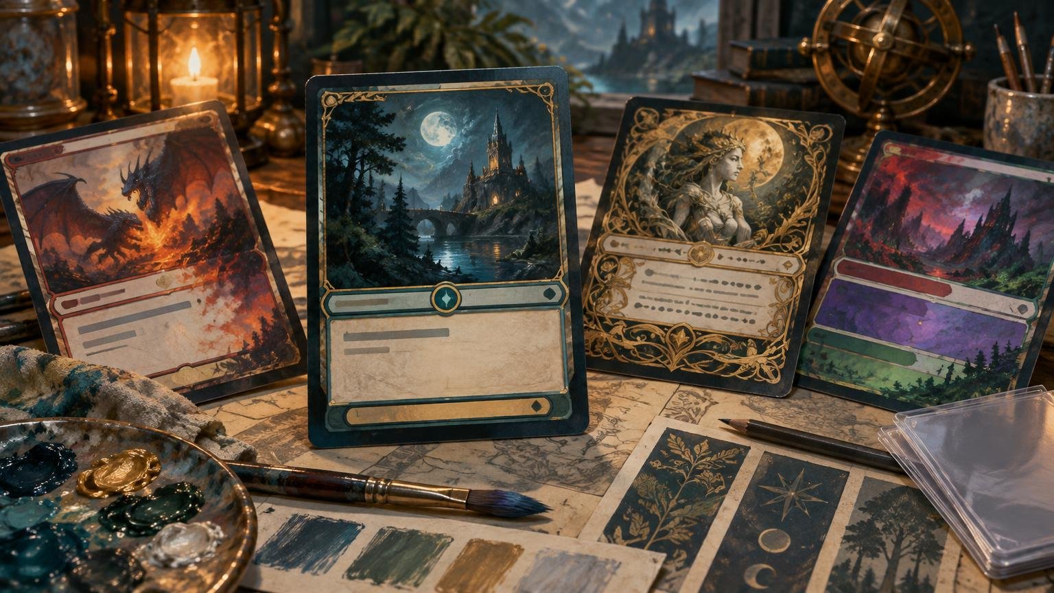
The point of an alternate frame is to give a proxy deck a visual identity, not to make its controller explain where the mana cost went. A frame can be radically different from a familiar Magic treatment and remain readable, but it needs a stable information hierarchy. Players should be able to find the card name, cost, type, rules text, and combat values without studying the composition every time the card changes zones.
That makes alternate frame proxy readability a project-level decision. One unusual showcase card may be easy to learn. Ninety-nine cards that rearrange their information independently turn a Commander deck into an interface problem. The line between expressive and excessive is crossed when the frame competes with recognition, conceals game information, or forces art appreciation to happen before gameplay comprehension.
TLDR
- Keep primary information in predictable locations even when the ornament, palette, and silhouette change.
- Use frame variations as repeatable category signals for groups such as lands, artifacts, tokens, and legendary cards—not as unrelated decorations.
- Judge the design at final card size and from across a table. A beautiful full-screen render can still fail in a sleeve.
- Reduce texture, transparency, and saturation behind rules text before shrinking the typography or moving essential fields.
- Proof representative problem cards before finalizing an entire deck, especially dark artwork, long rules text, unusual card types, and double-faced cards.
An alternate frame is still an interface
A Magic card is both an illustration and a compact game interface. The Comprehensive Rules describe the type line as sitting directly below the illustration and the text box as the usual location for rules text. They also establish current Oracle text as the governing wording rather than necessarily the wording on an older printed version. Those conventions give players a learned scanning pattern, even when official treatments vary. Magic’s Comprehensive Rules
A custom frame does not have to duplicate that conventional structure pixel for pixel. It does need to answer the same questions quickly: What is this card? What does it cost? What kind of permanent or spell is it? What does it do? What values matter in combat? Moving one field can be an intentional style choice. Moving every field, changing their alignments, and embedding them in illustration details removes the map a player uses to read the card.
The strongest approach is to separate the information grid from the decorative skin. Establish fixed zones for the name, mana cost, type line, rules text, and power/toughness or loyalty. Then build the unusual borders, motifs, textures, and category markers around that grid. Our guide to choosing a visual direction for a full alternate-art deck develops that system across an entire project rather than treating cards as isolated posters.
Five signs the design has gone too far
1. The art controls the text instead of supporting it
Full-art composition creates a common trap: every open patch of sky, wall, or fog looks like a possible text box. That may work for one image, but the next card will have a face, sword, or bright explosion in the same location. If text placement follows each illustration independently, the deck loses its shared reading pattern.
Use the frame to create a dependable reading surface. A restrained opaque panel, a controlled gradient, or a simplified local texture is usually better than placing white text directly over whatever part of the illustration happens to be darkest. If the panel feels too intrusive, revise its shape and integration before sacrificing contrast.
2. Every card is a special case
Variation is useful when it communicates a category. A different crown around legendary cards, a distinct land treatment, or a narrower rules panel for tokens can help navigation. Variation becomes noise when each card gets a unique frame architecture merely because its art suggested one.
Write the variation rules before applying them. For example, creatures might share one nameplate shape, noncreature spells another, and lands a third. The commander can receive one deliberate exception. Consistent information placement matters more than identical ornament, and controlled variation can distinguish categories without interrupting readability.
3. Decorative symbols look functional
Magic already uses icons, symbols, counters, color cues, and badges to communicate information. Decorative icons in a text box generally have no gameplay effect under the rules, but a symbol can still look as though it should matter. A row of ornamental gems beside an ability may resemble a resource tracker. A large faction seal beside the mana cost may look like an additional cost or color marker.
Keep purely decorative symbols away from functional clusters. If the deck uses a symbol as a category cue, give it one meaning and one position across the project. Do not let the same glyph mean “artifact” on one card, “legendary” on another, and nothing at all on a third.
4. Color stops helping players scan
Wizards’ discussion of playtest cards notes that color cues help players scan cards quickly and that visually ambiguous treatments can slow recognition. It also warns that important information can be missed when buried in reminder text or phrased too colloquially. Wizards’ playtest-card discussion
For an alternate-frame deck, color should have a defined job. It might indicate color identity, card type, deck faction, or rarity within the project, but asking it to perform all four jobs creates conflicts. A five-color deck can still use a tight art palette, provided functional color cues remain distinguishable. The deck-wide color palette workflow is useful for assigning colors to backgrounds, accents, information panels, and exceptions before the project sprawls.
5. The frame wins at full-screen size and loses in a sleeve
Thin filigree, translucent labels, tiny divider lines, and subtle value changes often look elegant in a large preview. Reduction removes that generosity. Fine decoration merges into texture, labels compete with art, and pale type loses its edge against highlights.
Do not solve this by making everything louder. Simplify. Remove a layer of texture, widen the quiet area around text, strengthen the distinction between the illustration and information panel, and reserve the most elaborate treatment for cards that can support it.
Build one frame system, not 100 layouts
Start by defining a base frame with a stable information grid. That is the default card, not the boring card. It establishes the visual grammar that makes later exceptions understandable.
- Place the name, mana cost, type line, rules panel, and combat or loyalty values in fixed zones.
- Choose one dominant alignment system. Mixing centered names, left-aligned type lines, and floating right-aligned rules text needs a compelling reason.
- Define the minimum quiet area around text and symbols. Artwork should not intrude simply because a particular crop is dramatic.
- Assign frame variants to categories before individual cards. Record which treatment belongs to creatures, spells, lands, tokens, legendary cards, and unusual layouts.
- Create a limited exception rule. The commander or a few signature cards may break the ornamental system, but they should preserve the information system.
This distinction lets a deck feel varied without becoming random. The border silhouette can change while the type line stays put. Legendary cards can gain an ornamental header while retaining the same name and cost relationship. Lands can use wider art windows while keeping their identity immediately visible.
Proof readability at three practical distances
A single zoomed-in review is not enough. Card-scale and tabletop-scale checks answer different questions: the first exposes text clarity and crop problems, while the second reveals weak category recognition, visual competition, and permanent groups that are difficult to distinguish. Add a hand-scale pass between them to see whether fanned cards remain navigable.
Final-size card check
View or print the design at its intended physical size. Read every line without zooming. Inspect small reminder text, loyalty abilities, power/toughness, mana symbols, and artist or unofficial-identification lines. If a field is only clear when enlarged, it is not finished.
Hand and battlefield check
Arrange several cards in a fan, then group representative permanents as they might appear in play. Can you find lands, artifacts, creatures, and the commander quickly? Do overlapping cards still expose useful category cues? Does one bright border dominate the battlefield despite representing an ordinary card?
Unfamiliar-reader check
Ask someone who did not design the frame to locate the name, cost, type line, rules text, and combat values. The goal is not a subjective vote on the artwork. It is to identify hesitation. If the reader repeatedly searches the wrong corner, the layout is teaching an unnecessary puzzle.
Design for print, not just the editor preview
Print preparation introduces additional risks around trim, safe zones, crop placement, line sharpness, and text clarity. PrintMTG’s production guidance advises checking alternate art and special treatments, spelling custom text carefully, confirming crop and placement, and correcting blurry or low-resolution previews before checkout. It also notes that deep darks, saturated reds, and neon-like colors can be sensitive in print.
Those considerations matter especially for alternate frames. A thin border near the cut edge makes minor visual shifts more obvious. A deep red translucent panel may merge with dark artwork. A bright neon accent can overpower a small type line. Keep essential information comfortably inside the safe area and avoid using a hairline border as the only feature defining the card’s geometry.
Proof a representative group before handing off the whole project: one dark card, one bright card, one text-heavy card, one land, one token, one legendary card, and each unusual layout. Track corrections with explicit filenames rather than overwriting files ambiguously. The custom proxy project checklist provides a broader workflow for revision control, special cards, and final handoff.
For a custom MTG project moving from screen proof toward physical cards, printmtg.com is one available next step. Recheck the current ordering interface for the exact frame, upload, preview, and production options your project requires.
A quick alternate-frame decision guide
| Design choice | Main readability risk | Better control |
|---|---|---|
| Full-art frame | Text competes with highlights and focal subjects | Create a repeatable quiet zone or stronger information panel |
| Transparent rules panel | Texture and value changes show through the text | Increase opacity locally and simplify the art beneath it |
| Different frame for every card | Players must relearn the layout repeatedly | Limit variants to defined card categories |
| Dark ornamental frame | Edges, symbols, and labels merge together | Separate adjacent values and test at final size |
| Borderless treatment | Trim and composition feel less forgiving | Keep critical elements inside safe areas and avoid fragile edge details |
| Decorative icons | Ornament resembles functional game information | Use one meaning and consistent placement, or remove the icon |
| Tiny text to preserve art | Rules become difficult to read | Allocate more panel space and edit the composition rather than the game text |
How to rescue a frame without abandoning the concept
When a frame fails, the theme is rarely the real problem. The failure usually comes from too many simultaneous decisions. Repair the information hierarchy first and keep the strongest thematic element.
- Turn off decorative layers and inspect the information grid by itself.
- Return the primary fields to consistent positions across every variant.
- Choose one signature motif—the arch, vines, circuitry, parchment edge, stained glass, or another device—and reduce competing motifs.
- Increase separation behind rules text before changing the typography.
- Apply the corrected frame to the hardest cards first. If it handles long text, dark art, multicolor identity, and unusual layouts, it will usually adapt more easily to simpler cards.
- Repeat final-size and tabletop checks before propagating the revision across the full deck.
This is also where version control matters. Save the repaired frame as a new master and document which card files use it. Otherwise, an old treatment will reappear when a card is replaced months later, quietly breaking the deck’s visual system.
Keep the project clearly unofficial
A readable alternate frame should also make room for a clear unofficial identifier rather than imitating authentication or provenance features. That protects the creative intent of the project and avoids presenting the card as an authentic printing. Wizards distinguishes personal, noncommercial playtest cards used outside sanctioned events from authentic cards required for sanctioned play, apart from narrow judge-issued replacements for cards damaged during an event. Wizards’ proxy-policy announcement Check the current event rules and organizer policy if sanctioned play is relevant.
Frequently asked questions
Does an alternate frame need to copy the standard Magic layout?
No. It needs a predictable hierarchy, not a pixel-level imitation. You can change silhouettes, borders, palettes, panel shapes, and ornament while keeping essential fields easy to locate. The further the layout moves from familiar conventions, the more consistently it should apply its own rules.
Is full art automatically less readable?
No. Full art becomes a problem when important text and symbols depend on unpredictable parts of the illustration for contrast. A repeatable panel, gradient, mask, or quiet zone can preserve both the artwork and the reading order.
Should every card type receive a different frame?
Only when the differences improve navigation and remain easy to learn. A few category-level variants can help distinguish lands, creatures, artifacts, tokens, or legendary cards. Too many variants weaken the shared visual language. Start with one base treatment and add only distinctions that perform a clear job.
Can the commander break the frame system?
Yes, but the exception should emphasize importance rather than rearrange basic information. Give the commander a stronger border, expanded motif, or unique accent while preserving the deck’s name, cost, type-line, and text-panel logic.
What should be proofed first?
Begin with the cards most likely to expose a weak system: long rules text, dark or highly detailed art, multicolor cards, double-faced layouts, tokens, lands, and the commander. Correcting those cases before applying the frame to the full deck prevents large batches of avoidable revisions.
The final rule: creativity should shorten recognition, not delay it
A successful alternate frame makes the deck feel more intentional while keeping play effortless. Preserve a stable information grid, let variation communicate categories, and test at real card size as well as across the table. If players notice the theme first and can still find every important field immediately, the frame is doing its job. If they must decode the frame before they can play the card, simplify the system before printing the other ninety-nine files.
References
- media.wizards.com
- How to Build a Color Palette for a Full Alternate-Art Proxy Deck – Custom MTG Proxies
- Playtest Cards | Magic: The Gathering
- Alternate-Art MTG Proxies: How to Choose a Visual Direction for a Full Deck – Custom MTG Proxies
- PrintMTG
- On Proxies, Policy, and Communication | MAGIC: THE GATHERING