
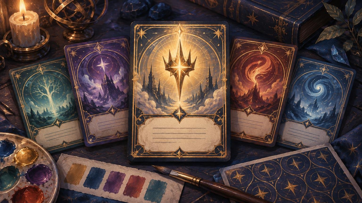
TLDR: The best custom MTG emblem proxies look related to their originating planeswalkers without looking like ordinary cards. Reuse one or two visual cues—palette, symbol, texture, or silhouette—but give every emblem a dedicated frame, a prominent EMBLEM label, a high-contrast ability panel, and an unmistakably unofficial treatment. Proof the complete helper-card family together, not one emblem at a time.
A planeswalker-themed deck can have beautiful alternate art and still feel unfinished when its emblems look like unrelated downloads. The solution is not to squeeze each planeswalker’s full frame language into another card. Treat the emblem as a purpose-built command-zone marker: its job is to identify an ongoing ability immediately, even when the battlefield is crowded.
What an MTG emblem is—and what the design must communicate
Under the supplied Comprehensive Rules source, an emblem is an object in the command zone with the abilities defined by the effect that created it. It is neither a card nor a permanent. Readers can use the official Magic rules page to locate the current rules document before finalizing a project.
That distinction should shape the layout. An emblem does not need to impersonate a battlefield permanent or a card that could be shuffled into the library. It needs to communicate three things quickly: this is an emblem, this is the ability it represents, and this piece belongs to a particular planeswalker or visual theme.
Put EMBLEM where a player can identify it at a glance. Give the ability text the strongest information hierarchy after that label. The originating planeswalker’s name can appear as a smaller reference, but it should not compete with the rules text. Mana cost, power and toughness, loyalty, rarity, and other normal-card signals are unnecessary and can make the aid harder to classify.
Derive the emblem from the planeswalker, not its entire frame
Start by extracting one or two visual cues from the planeswalker. Good candidates include a signature color pair, faction symbol, recurring shape, environmental texture, costume detail, or magical effect. A blue-white geometric halo, a scorched red edge, or a branching green motif can establish the relationship without copying every panel and ornament.
Limit the inheritance deliberately. If the planeswalker has a complex frame, detailed character art, glowing loyalty symbols, and several accent colors, repeating all of them on the emblem creates noise. Choose a dominant cue and a supporting cue, then place them around a stable emblem structure.
- Primary cue: the feature that identifies the originating planeswalker, such as a symbol or dominant hue.
- Supporting cue: a texture, secondary color, or border motif that reinforces the connection.
- Fixed emblem structure: the EMBLEM label, ability panel, type treatment, and clearly unofficial identifier.
- Controlled exception: a special treatment reserved for the deck’s signature planeswalker or most important emblem.
For a deck with several planeswalkers, first define a project palette rather than sampling colors independently from every illustration. The deck-wide color palette workflow explains how to assign repeatable roles to dominant, support, accent, and neutral colors. Emblems can use the same palette while shifting the proportions—for example, more neutral space behind text and less saturated color in the frame.
Build a dedicated emblem frame system
A dedicated frame creates recognition across the whole project. Keep its geometry stable even when the artwork and accent colors change. A wide title band, a distinctive top arch, a seal-shaped art window, or an asymmetrical side marker can tell players “emblem” before they read a word.
| Layout element | Recommended role | Avoid |
|---|---|---|
| EMBLEM label | First-read category marker | Small decorative type or low-contrast placement |
| Ability panel | Largest functional area with quiet backing | Detailed art directly behind dense text |
| Source reference | Small planeswalker name or icon | Recreating a full normal-card name line |
| Artwork | Mood, identity, and visual connection | Critical details hidden under the text box |
| Border or silhouette | Consistent emblem-family identifier | Using the same structure as creature tokens |
| Unofficial marker | Clear project identification | Official-looking collector or authentication details |
Do not assume a large digital preview represents the finished result. Fine filigree, subtle gradients, narrow outlines, and condensed labels can disappear when reduced. The ability panel should remain calm enough that the wording is readable without relying on glow effects or heavy shadows.
Keep exact wording separate from decoration
Copy the current Oracle wording for the specific emblem rather than typing it from memory or abbreviating it to fit the artwork. No individual emblem text is supplied in the research packet, so each project needs a separate wording check. If the text does not fit comfortably, enlarge the panel, reduce decorative elements, or revise the crop before shrinking the type.
Treat wording as locked content once verified. Art, crop, texture, and accent color may continue through revisions, but a visual edit should not silently create a new text version. This separation prevents an attractive late-stage mockup from restoring old wording.
Give every helper-card category its own visual grammar
Matching does not mean identical. Emblems, creature tokens, Monarch or Initiative markers, and other table aids can share palette and illustration style while retaining different structural cues. The site’s art-direction guidance likewise recommends distinct treatment for helper pieces so they are not mistaken for library cards.
- Emblems: prominent category label, ability-first layout, command-zone visual treatment.
- Creature tokens: creature name, type line, power and toughness, and art-led battlefield recognition.
- Monarch or Initiative markers: oversized status title and directional or reminder-focused layout.
- Counters or achievement aids: compact label, icon-led recognition, and minimal text.
- Library cards: the project’s normal card frame and information hierarchy.
One practical approach is to reserve a unique silhouette for each category. All emblems might use clipped upper corners, while tokens retain ordinary rounded card geometry and status markers use a broad horizontal title band. This remains useful when several pieces share the same black, gold, and violet palette.
If the deck includes personalized tokens or portraits, use the same category discipline described in the guide to building coordinated photo token sets. The portraits can match the deck’s mood, but their token information should remain structurally different from an emblem’s ability-first layout.
Manage emblems as part of the deck project
Large custom projects become fragile when “final” is only a filename. Create a manifest with one row per emblem and record the originating planeswalker, verified wording date, artwork source or permission note, crop revision, frame version, approval status, and export filename. The same source recommends tracking artwork, crop, frame, version, and approval information across a themed project.
Use filenames that expose identity and revision, such as emblem-character-ability-v03, rather than final-emblem-new. Keep the editable source separate from the approved export. If a planeswalker or wording changes later, the manifest should show which emblem requires replacement without forcing you to inspect every file.
Artwork records matter as well. Personal, commissioned, licensed, and third-party images do not carry the same permissions. Keep a note of where each image came from and any relevant license or artist agreement; do not treat an image being available online as permission to reproduce it.
Proof the complete visual family together
An emblem can look excellent in isolation and still fail beside the rest of the deck. Build a shared proof sheet containing at least one planeswalker, its emblem, a creature token, a basic land, a dense-text card, and a dark-art card. Coordinated-project guidance supports shared proof sheets and stable revision tracking rather than evaluating every component separately.
Review the proof near intended card size, then place the samples in a rough battlefield arrangement. This is an editorial design check rather than a claim of tested performance. Ask whether the emblem can be classified quickly and whether its ability remains readable without picking it up.
- Cover the artwork and check whether the frame alone still reads as an emblem.
- Cover the frame and confirm that the ability panel retains sufficient contrast.
- Compare it with a creature token and make sure their title and stat structures cannot be confused.
- Place it beside the originating planeswalker and check for a clear relationship without duplication.
- Check dark and bright emblems together so one palette extreme does not lose text contrast.
- Confirm the EMBLEM label, ability text, unofficial marker, and export version.
- Print or export one revised sample before committing the entire helper-card group.
When the files are approved and the project is ready to move beyond screen proofs, a service for printing MTG proxies can be considered as the next production step. Recheck the destination’s current file requirements and options before handing off the project.
Should a custom emblem have a back?
A back is useful for deck branding, orientation, and keeping a helper-card set visually complete, but it should not make the piece resemble an authentic library card. A project logo, large EMBLEM mark, planeswalker crest, or deliberately nonstandard pattern is more appropriate than an official-looking card back.
If the deck uses double-faced cards or multiple helper categories, backs can also prevent sorting mistakes. Use one emblem back across the project, or add a small category identifier while preserving the same deck logo and border system. The important rule is that the back clarifies the object’s role rather than disguising it.
Casual play and event expectations
Custom emblems should be presented as clearly unofficial table aids. In casual Commander, explain the custom pieces before play, particularly if their art or shape differs substantially from familiar emblem treatments. Related site guidance supports readable, disclosed proxies and clear playgroup communication.
For organized play, ask the organizer or judge before relying on any player-made component. Wizards stated in a January 14, 2016 policy post that sanctioned events required authentic Magic cards apart from narrow judge-issued replacements for cards damaged during that event. That post is historical context, not a substitute for current event guidance.
Frequently asked questions
What information should appear on a custom emblem proxy?
Include a prominent EMBLEM label and the exact verified ability text. An originating planeswalker reference, artwork credit, project mark, and clearly unofficial identifier are useful additions. Avoid decorative game elements that imply the emblem has a mana cost, loyalty, or combat statistics.
Does every planeswalker need a unique emblem frame?
No. Use one structural emblem frame across the deck, then vary art, palette accents, symbols, and textures. A stable frame makes the category recognizable; controlled variation identifies the source planeswalker.
How should emblems differ from tokens?
Make emblems ability-first and tokens creature-first. Tokens need immediate access to creature identity and power/toughness, while emblems need a category label and readable ongoing ability. Different title geometry or border silhouettes reinforce the distinction.
Can every emblem use the planeswalker’s dominant color?
Yes, but treat that color as an accent when it harms text contrast. Reuse the hue in borders, icons, or restrained gradients while keeping the ability panel neutral and readable.
What is the minimum useful proof set?
Proof one planeswalker, its emblem, one token, one land, one dense-text card, and one dark-art card together. That small group exposes category confusion, palette imbalance, weak text contrast, and inconsistent borders before the full project is finalized.
The design rule to keep
Make the relationship visible, but make the object type unmistakable. A successful emblem borrows the planeswalker’s visual identity while preserving its own frame, hierarchy, and command-zone role. Lock the verified wording, test the visual family together, and approve one representative sample before exporting the rest.
References
- media.wizards.com
- magic.wizards.com
- Deck Themes & Art Direction – Custom MTG Proxies
- How to Build a Matching Basic-Land Cycle for a Custom Commander Deck – Custom MTG Proxies
- How to Use MTG Proxies to Test a Commander Deck Before Buying Cards – Custom MTG Proxies
- On Proxies, Policy, and Communication | MAGIC: THE GATHERING