
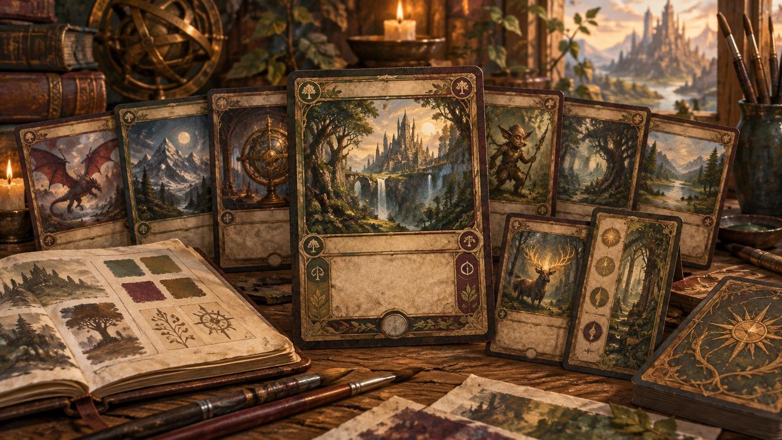
TLDR: The best retro frame MTG proxies do not force every card into one identical historical shell. They establish a shared visual language—border character, restrained color, illustration style, typography mood, and recurring texture—then make deliberate exceptions for dense text, double-faced cards, Sagas, planeswalkers, and table aids. Choose the system first, select individual versions second, and proof the entire deck at card size before printing.
A convincing vintage deck is less about making every card look old and more about making every card look as though it came from the same imagined era. For retro frame MTG proxies, that means deciding what “retro” means for this particular project. It could reference the original old-border atmosphere, follow the spirit of an official modern retro treatment, or use an original vintage-print direction without closely reproducing a specific historical layout.
Define what retro frame MTG proxies mean for your deck
“Retro frame” already has an official use within Magic. Wizards used the term for a nostalgic card treatment in Modern Horizons 2, describing it as a continuation of the treatment seen around Time Spiral Remastered. Wizards’ Modern Horizons 2 collecting guide shows how the publisher used that terminology for a modern release. Your custom project does not have to replicate that treatment exactly. It needs a clear reference point that can guide 100 related decisions.
Choose one of three directions before collecting art or card images:
- Historical old-border feel: muted frames, illustrated rather than cinematic art, restrained effects, and a strong sense of printed material.
- Official-retro-inspired direction: modern cards and compositions presented with a nostalgic frame language, while keeping contemporary information readable.
- Original vintage fantasy direction: aged paper, engraved ornament, limited palettes, woodcut or storybook illustration, and other period cues without pretending to be a particular official release.
Write the choice as a one-sentence brief. For example: “This deck should feel like a weathered fantasy field guide, using warm paper, inked creatures, dark metal artifacts, and cleaner exceptions for mechanically complex cards.” That sentence is more useful than a folder called “old cards,” because it tells you which versions belong and why.
Set the visual rules before selecting versions
Version selection becomes messy when each card is judged alone. One card has beautiful parchment art, another has a convincing old border, and a third has dramatic foil effects. Each may look good independently while the deck looks like a binder page assembled from unrelated sets.
Prevent that drift with five non-negotiable rules:
- Border family: decide whether borders are warm, dark, metallic, color-coded, or mostly neutral. Keep their apparent weight consistent.
- Palette: assign jobs to color. Parchment might be the base, faded faction colors may identify card groups, and one brighter accent can mark important information.
- Illustration texture: choose painted, inked, engraved, storybook, pulp-fantasy, or another coherent family. Multiple artists can work if their images share compatible texture and composition.
- Material language: decide whether the deck appears printed on paper, carved into wood, stamped onto metal, or preserved in an archive. Do not mix every aging effect simply because each one looks “vintage.”
- Weathering limit: specify whether wear appears on frames only, lightly across the image, or not at all. Heavy scratches behind rules text usually reduce clarity rather than adding character.
A deck-wide palette is especially useful when the deck contains several art styles. The alternate-art deck color-palette guide explains how to give colors functional roles instead of choosing them card by card.
Select versions in a hierarchy, not at random
Do not begin alphabetically. Start with the cards that establish the deck’s identity and the groups that appear repeatedly. These choices create visual anchors against which less important versions can be judged.
| Card group | Visual role | Selection rule |
|---|---|---|
| Commander and signature cards | Establish the strongest expression of the theme | Allow extra ornament or contrast, but preserve the deck’s palette and material language. |
| Basic lands and land cycles | Create repetition across many draws and battlefield states | Use one repeatable frame rule with controlled variation in scenery or color. |
| Artifacts and enchantments | Define the deck’s objects, relics, and persistent effects | Give each category a recognizable material or compositional cue. |
| Creatures and spells | Provide most of the visual variation | Select art that fits the shared texture, crop, and contrast rules. |
| Tokens and table aids | Communicate temporary objects and game state | Keep them related to the deck but visibly distinct from library cards. |
The commander can carry the most nostalgic treatment because it remains a focal point. Signature cards can echo one motif from it—a crest, a corner ornament, a red accent, or a particular illustration treatment—without becoming miniature copies.
Lands deserve early attention because they appear frequently and occupy a large part of the battlefield. A matching cycle does not require identical pictures. It needs a stable frame, repeated title treatment, predictable color cues, and enough landscape variation to distinguish land types. The matching custom basic-land cycle guide provides a fuller framework for controlled variation and table recognition.
Use controlled variation to avoid visual monotony
Cohesion is not sameness. A deck with one sepia filter applied to every image can become flat, particularly when cards are viewed in a crowded battlefield. Variation should happen inside the rules rather than outside them.
One practical approach is to reserve different illustration modes for mechanical groups. Creatures might use painterly portraits, instants and sorceries could use looser narrative scenes, and artifacts could use engraved object studies. They still belong together if they share the same paper tone, border weight, title treatment, and contrast standard.
Multiple artists can also fit one retro deck. Judge compatibility at card size rather than by artist name alone. Look for similar edge handling, value range, lighting, and compositional density. A quiet watercolor landscape and a heavily rendered digital battle scene may clash even when their colors match. Conversely, an ink drawing and a woodcut can coexist if both use bold silhouettes and generous negative space.
Plan readable exceptions before they become problems
Modern cards often carry information that older-looking layouts were not designed to accommodate. Treating every exception as a last-minute compromise produces cramped type and inconsistent fixes. List the difficult card types in the project brief and give each one an approved treatment.
Dense rules text
Let information density override nostalgia. Use a quieter art crop, cleaner text field, and reduced weathering. A card that is repeatedly picked up and reread slows the game and weakens the project, no matter how convincing its aged texture looks.
Double-faced cards
Give both faces the same border family while using a repeated transformation cue, such as a changed paper tone, reversed ornament, or altered accent color. Record both face files together in the manifest so a revision to one does not leave the other behind.
Planeswalkers, Sagas, and unusual layouts
Preserve the information architecture that makes the card usable. A Saga still needs visually clear chapters; a planeswalker needs distinct loyalty abilities and starting loyalty; a counter-heavy permanent needs obvious places to track its state. The retro treatment should wrap around those functions rather than camouflage them.
Tokens, emblems, and table aids
Tokens, emblems, Monarch or Initiative cards, and other helpers should look related without being mistaken for cards from the library. Give them a separate border color, oversized label, icon band, or reverse-side treatment. This is one place where a deliberate break in the system improves play.
Decide whether the project needs a custom back
A custom back can make a retro deck feel like a complete object rather than a stack of decorated fronts. Reuse two or three elements from the face system: the paper tone, border ornament, project symbol, or deck name. Avoid turning the back into another busy illustration competing with the fronts.
For double-faced cards and shared Cube environments, consistency matters more than novelty. Decide whether every card receives the same back, whether DFCs use clearly labeled reverse faces, and whether tokens have a separate back family. Also keep the cards clearly unofficial; a custom project does not need to imitate official branding or authentication elements.
Proof the deck as a playable visual system
A full-screen image can conceal weak contrast, tiny labels, overworked texture, and muddy crops. Proof representative cards at intended play size before approving the whole deck. Include the darkest card, the busiest illustration, the longest rules text, each unusual card type, one basic land of every type, and every helper-card family.
Run three practical checks:
- Hand check: fan seven representative cards. Titles, mana costs, and card categories should remain easy to distinguish without studying each piece.
- Battlefield check: arrange lands, creatures, artifacts, enchantments, tokens, and a table aid as they might appear in play. Step back and confirm that permanent types and game-state markers remain recognizable.
- Consistency check: review thumbnails of the entire project at once. Outliers in border color, crop scale, aging, or typography become easier to spot in a grid than one file at a time.
When the visual direction and files are settled, printing MTG proxy cards is the next production stage rather than the place to make unresolved art-direction decisions. Lock versions, names, and face assignments before handoff so the printed set reflects one approved project state.
Keep a retro proxy project manifest
A manifest prevents a late replacement from looking as though it wandered in from another deck. It can be a simple spreadsheet or document, but it should identify every file and the rule governing it.
- Card name and deck role
- Chosen artwork or version reference
- Artist or asset source, where applicable
- Front and back filenames
- Card-category treatment
- Revision number and approval status
- Special handling for DFCs, tokens, emblems, or alternate states
- Notes about crop, contrast, or text-field exceptions
Use original, commissioned, or appropriately licensed artwork, and document what each asset is cleared for. A visual theme does not itself provide permission to reproduce official art, logos, card backs, or third-party artwork.
Frequently asked questions
Should every card use exactly the same retro treatment?
No. Every card should follow the same system, but not necessarily the same layout. Dense cards and unusual card types may need cleaner treatments. Cohesion comes from repeated rules for border, palette, texture, and hierarchy—not from forcing identical decoration onto every file.
Which cards should look the most nostalgic?
Prioritize the commander, signature cards, and basic lands. They establish identity through prominence or repetition. Keep routine cards slightly quieter so the deck has a visible hierarchy.
Can I mix official card versions with custom retro-style versions?
Visually, yes, if they share compatible borders, art character, contrast, and color temperature. Compare them as thumbnails and at play size. If one group looks substantially cleaner, brighter, or more digitally rendered, it may need a different selection or a controlled project-wide adjustment.
Are retro proxies acceptable at an event?
Ask the organizer and check the current rules for that event. Wizards’ January 2016 statement distinguished personal, non-commercial playtest cards from counterfeits, while stating that sanctioned events required authentic Magic cards apart from narrow judge-issued replacement circumstances. Because that statement is dated, use the current WPN Policy Hub and direct organizer guidance rather than treating the older announcement as a blanket answer for every current setting.
What is the fastest way to detect an inconsistent version?
Export or arrange every front as a small thumbnail grid. Look first for abrupt changes in border value, title scale, art brightness, and weathering. Those differences usually appear before subtler stylistic conflicts.
Finish with one rule you can enforce
A strong retro deck does not need to impersonate one exact year of Magic. It needs to feel intentionally older, remain legible, and preserve that direction across lands, spells, tokens, backs, and future replacements. Write the brief, approve the category rules, identify the exceptions, and proof a representative battlefield before committing the whole project. If a version looks attractive but breaks the system, save it for another deck.