
TLDR
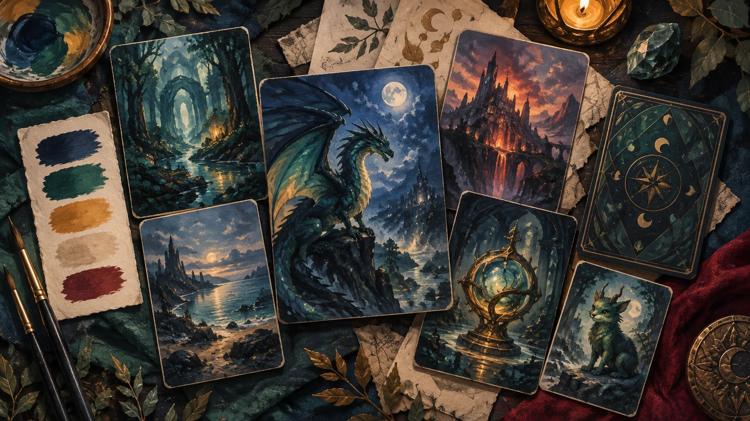
Build an alternate art proxy deck color palette by choosing one dominant color family, one supporting family, and one restrained accent. Then write separate rules for the commander, lands, artifacts, multicolor cards, tokens, and card back. Do not require every illustration to match exactly. Cohesion comes from repeated relationships—similar shadows, recurring accents, consistent crops, and a stable information hierarchy—not from turning all 100 cards the same color.
The quickest way to make a full alternate-art deck feel intentional is to define its visual rule before collecting dozens of images. A useful rule explains the setting, mood, palette, medium, recurring motif, and important exclusions in one sentence. It should also leave enough contrast for names, mana costs, type lines, rules text, and combat-relevant numbers to remain easy to find.
Start with a one-sentence art-direction brief
A theme such as “dark fantasy,” “watercolor,” or “cyberpunk” is too broad to guide individual choices. It describes a neighborhood, not an address. Two artists can interpret dark fantasy with completely different palettes, lighting, detail levels, and character proportions. Both images may look good alone while fighting each other in the same hand.
Turn the theme into a sentence that can accept or reject artwork. For example: “A rain-soaked coastal deck using blue-gray shadows, desaturated green environments, small copper light sources, painterly textures, and no bright modern neon.” That brief gives every card a shared visual climate without demanding identical compositions.
A complete brief should establish:
- Setting: ruined coast, storybook forest, celestial observatory, family-photo album, or another defined place.
- Mood: solemn, celebratory, eerie, warm, adventurous, restrained, or playful.
- Dominant family: the colors that occupy most backgrounds and large shapes.
- Supporting family: the secondary hues used for environments, clothing, frames, or effects.
- Accent: a scarce, high-attention color reserved for spells, eyes, flames, symbols, or legendary details.
- Medium and texture: ink, oil-paint simulation, cut paper, photography, engraving, animation-inspired shading, or another consistent treatment.
- Recurring motif: moons, ivy, stained glass, waves, geometric lines, or a playgroup emblem.
- Exclusions: colors, visual genres, border treatments, or detail levels that would break the system.
The exclusions are especially useful. “No bright white backgrounds” is easier to apply than “keep it moody.” “No photorealistic characters except the commander” turns a vague preference into a deliberate exception.
Choose a palette model, then assign practical roles
Monochromatic, analogous, complementary, and triadic combinations are established ways to organize color relationships. Adobe’s overview of color combinations describes these as approaches designers can use when exploring palettes. For a deck project, treat them as creative constraints rather than formulas that every image must obey.
| Palette model | Useful deck application | Main risk |
|---|---|---|
| Monochromatic | A spectral, dreamlike, winter, or single-faction deck where value changes provide most of the separation. | Cards can blur together if every subject, background, and frame has similar brightness. |
| Analogous | A natural-feeling palette built from neighboring hues, such as blue, blue-green, and green. | Without a distinct accent, important objects may not attract attention. |
| Complementary | A dominant cool or warm family paired with a contrasting accent for spells, symbols, and legendary moments. | Equal amounts of both sides can become visually loud rather than controlled. |
| Triadic | A colorful project in which three separated hue families identify card groups or narrative factions. | Using all three colors at full saturation on every card can make the deck feel scattered. |
After choosing the model, give colors jobs. A workable hierarchy might allocate the blue-gray family to backgrounds and shadows, muted green to creatures and landscapes, and copper to small focal details. The exact proportions can vary from card to card. What should remain stable is the relationship: copper stays special because it does not cover half of every illustration.
Value and saturation matter as much as hue. A dark navy creature against a dark green forest may technically fit the palette but disappear at card size. Separate the subject from the background with a lighter edge, quieter backdrop, brighter focal area, or darker text backing. If everything is saturated, nothing receives emphasis.
Do not force the artwork to copy each card’s mana color
A blue card does not need blue art, and a red card does not need a red scene. Literal color matching can be helpful, but requiring it across a multicolor Commander deck often fragments the visual direction. Keep mechanical color information in stable interface elements such as mana symbols and other familiar card cues. Let the artwork follow the deck’s broader world.
Mana colors can still influence the palette subtly. In a misty folklore deck, white cards might lean toward pale morning light, black cards toward deep violet shadows, and green cards toward moss. They remain inhabitants of the same world because the base palette, texture, and lighting logic do not change.
For multicolor cards, avoid cramming every associated mana hue into the illustration. Instead, combine two existing palette roles: perhaps one color controls the environment while another appears in the subject or magical effect. This keeps a multicolor card distinctive without making it look imported from a different project.
Write rules for each card group
Deck cohesion becomes easier when recurring card groups have their own art-direction rules. These are controlled variations within the palette, not separate themes.
Commander and signature cards
The commander should be identifiable immediately. Give it one privilege the rest of the deck does not receive: the brightest accent, a centered portrait, a unique border ornament, or a wider value range. Pick one or two exceptions rather than every possible effect. If the commander is brighter, borderless, highly saturated, and rendered in a different medium, it may stop looking related to its own deck.
Basic lands and the mana base
Lands are ideal for reinforcing setting because they recur frequently. Build a small visual sequence rather than using one image repeatedly: coast at dawn, marsh in rain, forest at dusk, and mountain under the same copper sky. Shared horizon placement, atmosphere, and accent color can unite different environments.
Nonbasic lands can use stronger landmarks, architectural motifs, or more unusual lighting. Their distinction should not depend solely on subtle art, however. Names and card information still need to do the mechanical work.
Artifacts and colorless cards
Colorless does not have to mean gray. Artifacts can borrow the deck’s supporting color while using a repeated material—copper, bone, glass, dark wood, ceramic, or carved stone—to establish their category. A shared material language is often clearer and less monotonous than desaturating every artifact.
Tokens, emblems, and helper cards
Tokens should look related to the permanents that create them while remaining distinguishable from one another. Reserve a consistent band, icon position, silhouette style, or background treatment for tokens. If the deck creates several creature types with similar power and toughness, silhouette and name readability matter more than making every token perfectly atmospheric.
Use the same principle for emblems, monarch or initiative reminders, and other shared table pieces: repeat the palette and motif, but change the structural treatment so nobody mistakes a helper card for a normal permanent.
Custom card backs
The back can repeat the dominant family and accent, but it should simplify them. A logo, project title, restrained motif, and clear unofficial identifier will usually survive reduction better than a second full illustration. If the project contains double-faced cards, decide early whether sleeves, checklist-style helpers, or another transparent play method will handle them; that decision can affect whether one universal back remains practical.
Build a mood board that can reject images
A mood board is useful only if it becomes a decision tool. Start with a small set of reference images representing the target shadows, accents, texture, composition, and environment. Add a second row of “not this” examples: excessive neon, flat midday lighting, dense visual noise, inconsistent rendering, or whatever contradicts the brief.
When reviewing a candidate image, ask four questions:
- Does it use the same dominant and supporting relationship as the reference board?
- Does its lighting appear to come from the same visual world?
- Can its focal subject survive the intended card crop?
- Does it introduce a new visual idea worth repeating, or is it merely an attractive exception?
One exception is a feature. Ten unrelated exceptions are a missing art direction.
Track assets and revisions before the project grows
A 100-card project can become difficult to audit if files are named “final,” “final2,” and “new-final.” Use a stable identifier for each card and separate source art, working files, exported proofs, and approved files. A simple asset tracker should include the card name, deck slot, artwork source, permission or license note, artist credit where applicable, crop status, palette review, text review, version number, and approval status.
Track every token and helper card as its own asset. Also record which card creates it. That relationship makes it easier to find missing pieces and update a token when its associated permanent changes.
Do not assume an image found online is available for reproduction. A historical Wizards article states that Magic card faces, art elements, and card backs are protected and that reproducing its card art or images requires permission; that article is useful rights context, but it is not individualized legal advice or a complete account of current law. Confirm the terms attached to commissioned, licensed, stock, personal, or third-party artwork and check the chosen provider’s current content policy before handoff.
Proof the deck as a playable visual system
Full-screen art can hide problems that become obvious when several cards are viewed together. Create a proof sheet with cards shown at their intended physical scale or as close as your workflow allows. Include representative dark cards, bright cards, lands, artifacts, multicolor cards, tokens, and the commander.
A useful proxy should retain the game information needed for clear play and be plainly distinguishable from an authentic card. The site’s Commander proxy-testing guide applies that principle to testing decks; it is equally important in an art-directed project. Check the following fields rather than judging the illustration alone:
- Card name is easy to locate without studying the illustration.
- Mana cost remains distinct from bright skies, spell effects, and border decoration.
- Type line is readable and not crowded by a motif.
- Rules text has sufficient separation from detailed or high-contrast artwork.
- Power and toughness, loyalty, defense, or other relevant values are easy to find when present.
- Legendary, token, emblem, and double-faced treatments are recognizable.
- Similar cards do not become indistinguishable when held in a fan.
- Dark artwork retains a clear focal subject rather than collapsing into one value.
- The unofficial nature of the project is clear and the design does not imitate authentication features.
Then perform a board-state proof. Arrange a dozen permanents, tokens, lands, and a commander as they might appear during a busy turn. Step back from the layout. Can you locate the commander, identify token groups, separate lands from nonlands, and find relevant combat values without picking up every card? If not, revise the category system before polishing individual illustrations.
When the approved files are ready for an external production handoff, verify the selected provider’s current file requirements rather than treating one export setup as universal. A destination such as PrintMTG may be a practical next step, but palette approval, readable proofs, rights tracking, and clean version control should happen before submission.
A reusable palette brief
Use this fill-in format before sourcing the full deck:
- Project world: This deck takes place in .
- Mood: It should feel , not .
- Dominant family: controls backgrounds, shadows, or large shapes.
- Supporting family: appears in environments, clothing, frames, or materials.
- Accent: is reserved for focal details and signature moments.
- Texture or medium: The artwork should resemble .
- Recurring motif: Repeat in restrained ways.
- Commander exception: The commander alone may use .
- Card-group rules: Lands use ; artifacts use ; tokens use .
- Exclusions: Reject images with .
- Readability rule: Every card must preserve clear identification of .
Frequently asked questions
How many colors should a deck palette contain?
Start with three functional roles rather than a strict number of swatches: dominant, supporting, and accent. Each role can contain lighter, darker, warmer, or cooler variations. This gives the artwork room to breathe while keeping the visual relationship stable.
Should every card use exactly the same frame treatment?
Not necessarily. Consistent information placement is more important than identical ornament. Small frame variations can identify legendary cards, tokens, lands, or artifacts, provided the variations follow written category rules and do not disrupt readability.
What if an ideal illustration does not match the palette?
First see whether crop, value, or saturation adjustments can bring it closer without damaging the image. If it still conflicts, reserve it for a deliberate exception such as the commander or replace it. Keeping an image solely because it looks impressive is how a coherent deck turns into a gallery of unrelated favorites.
Can alternate-art proxies be used in sanctioned Magic events?
Do not assume they can. Wizards’ 2016 policy announcement said DCI-sanctioned events require authentic Magic cards, apart from narrow judge-issued replacement situations involving cards damaged during an event. It separately discussed personal, noncommercial playtest cards not intended to resemble real cards. Read the Wizards announcement and check the current event and WPN policies with the organizer before relying on that historical statement.
Make the palette a rule you can proof
The strongest alternate-art decks do not make every card identical. They repeat a controlled relationship: the same atmospheric shadows, the same restrained accent, the same material language, and the same hierarchy of game information. Write the brief, approve a representative sample from every card group, and test those cards together before completing the rest. If the sample reads as one world from across the table, the palette is doing its job.